Full UX Project - Greenhead App
GREENHEAD - The app designed to reduce waste at work
USER RESEARCH
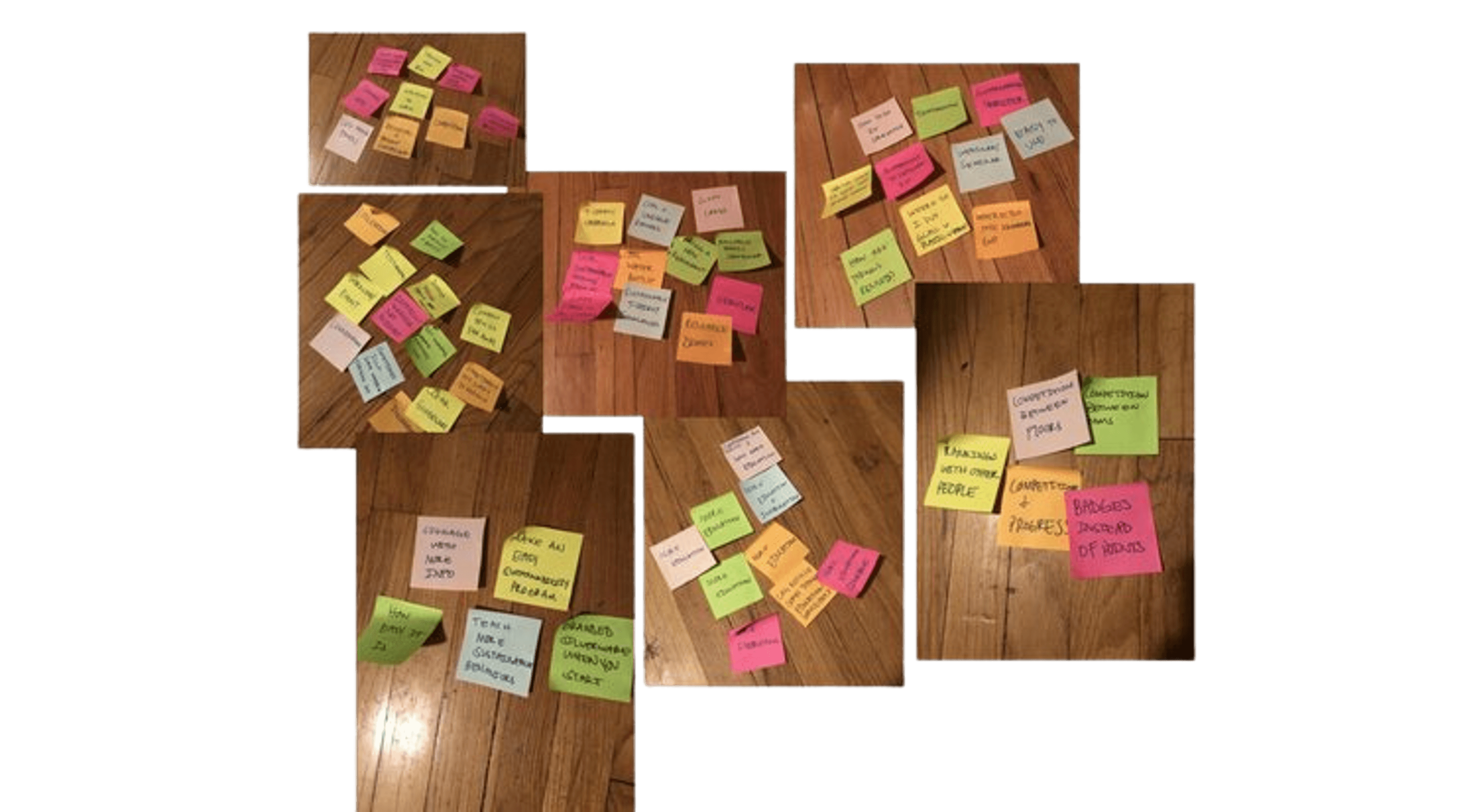
We started the project by interviewing employees of Company T in Denver, CO regarding habits surrounding sustainability. In-person interviews were conducted with six employees ranging in age, marital status, race, gender and sexuality. The biggest themes we found were regarding how important sustainability is to these employees, how motivated employees are to be sustainable at work and how big of an impact information serves when making sustainable choices.
USER PERSONA
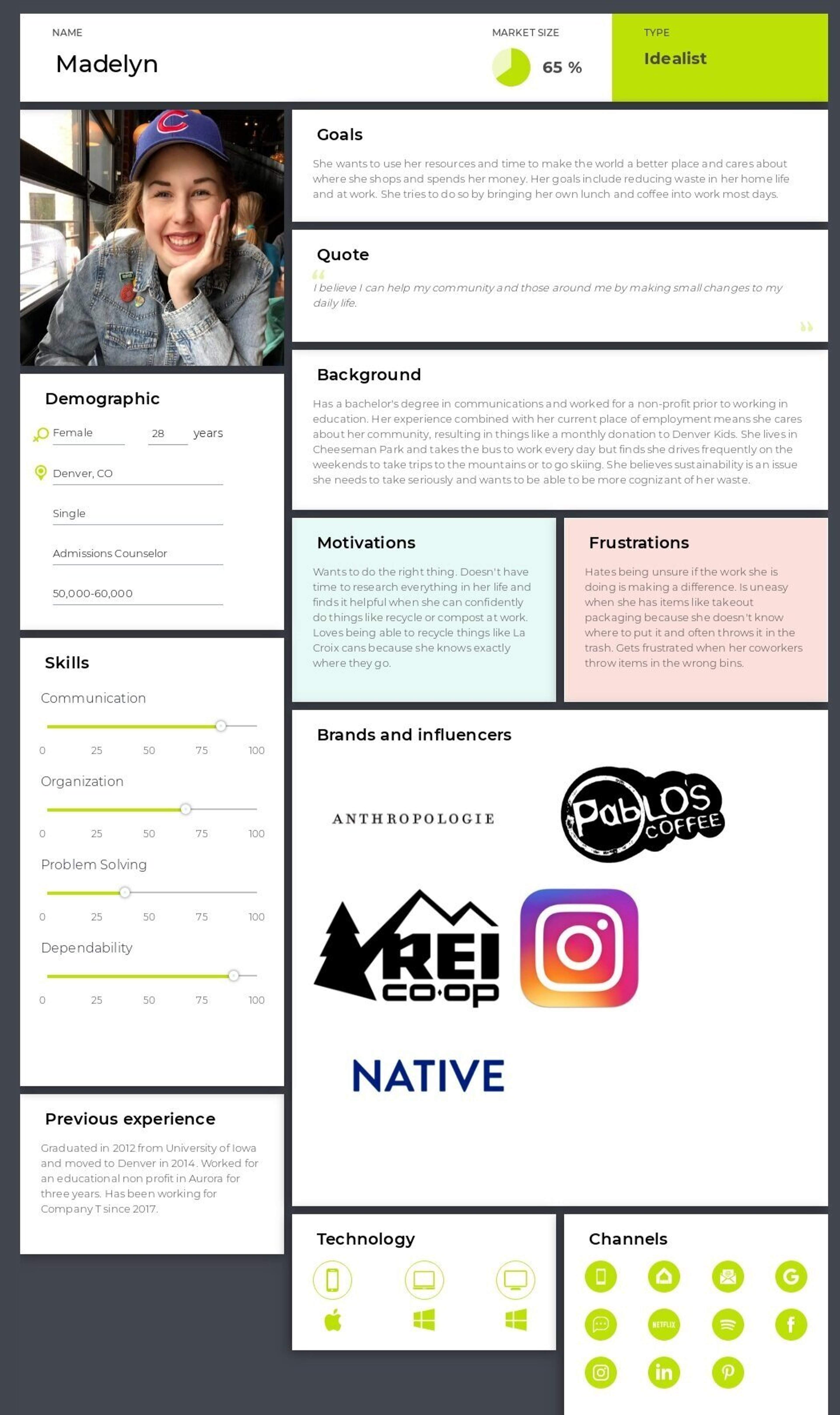
After dissecting the research and finding themes within the interviews, we moved on to create a User Person. Based on the data, we created Madelyn, a woman in her late 20s who is consistently looking to do the right thing and wants to make a difference in her job and community.
OPEN CARD SORT
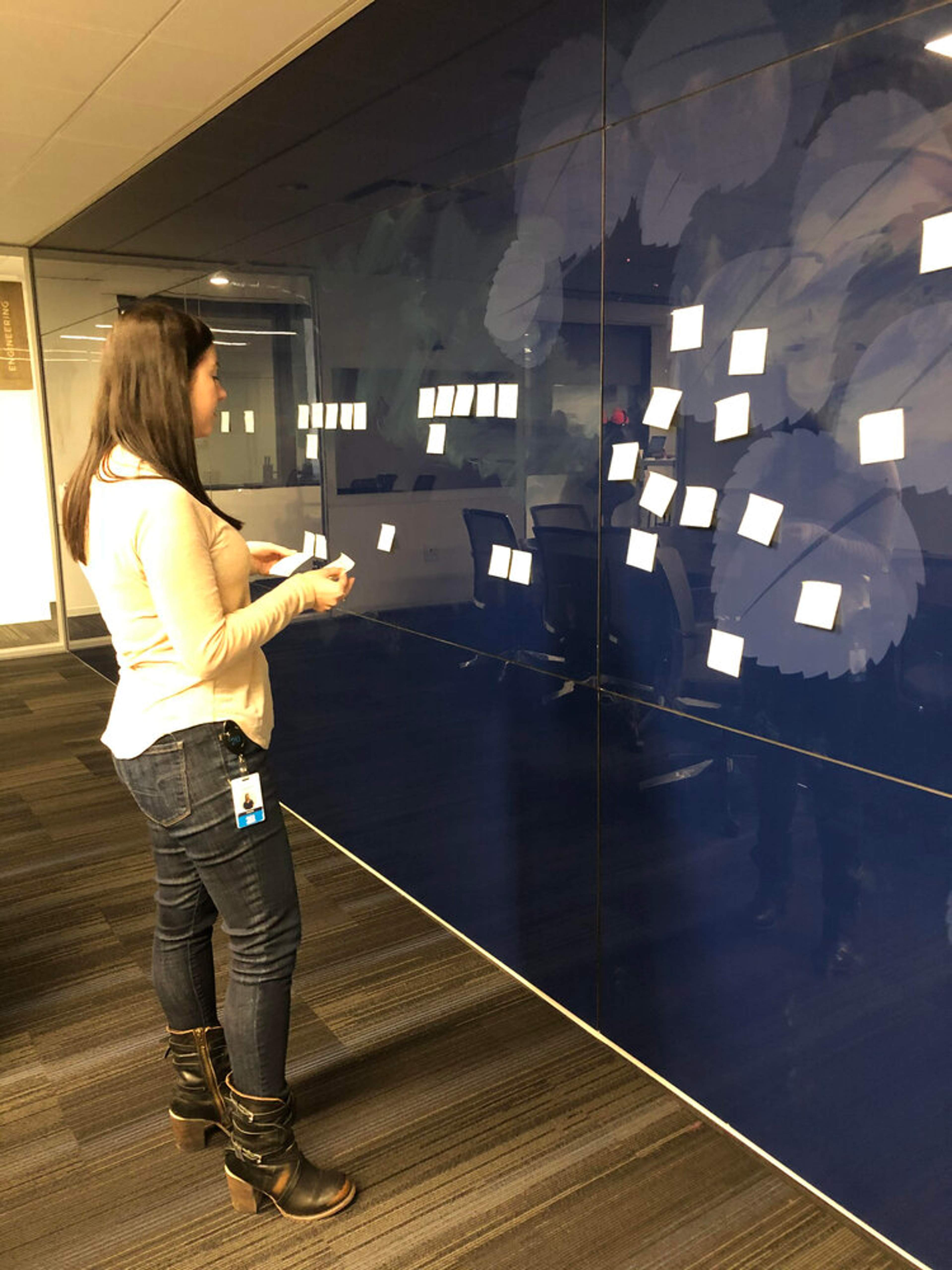
After we determined the types of categories we wanted to include in the app, we consulted with two other employees of Company T to participate in an open card sort. The results were consistent with each other and we were able to revise several menu items to reflect the feedback given.
PROTOTYPE
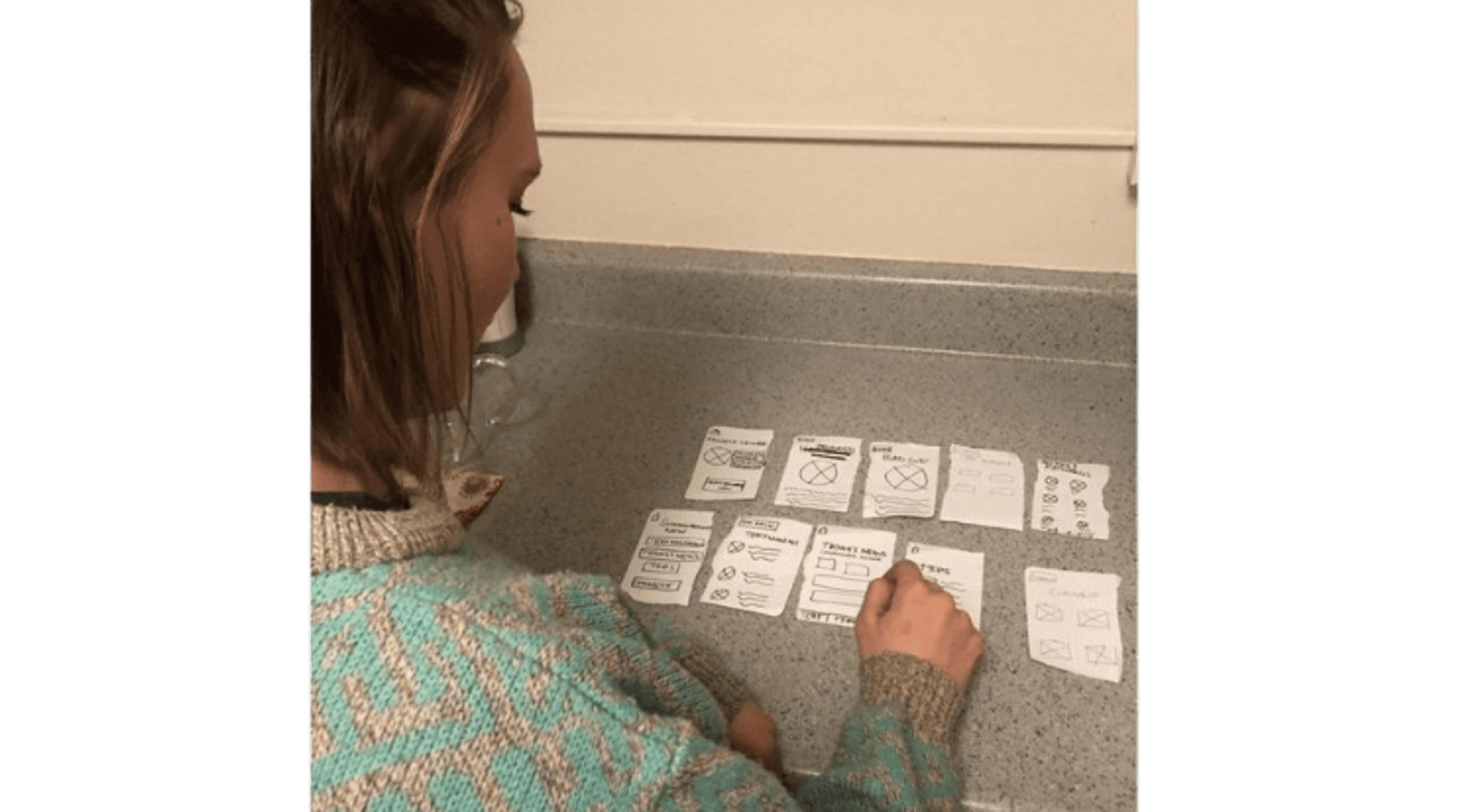
Our next move was to begin working on the prototypes. We created a paper prototype with each key screen. After having a Company T employee perform several basic tasks within the paper prototype, we noticed the back button wasn’t as intuitive as we thought. We revised where the location of the back button was to make it more user friendly based on the feedback from the paper prototype test.
SKETCHES & WIREFRAMES
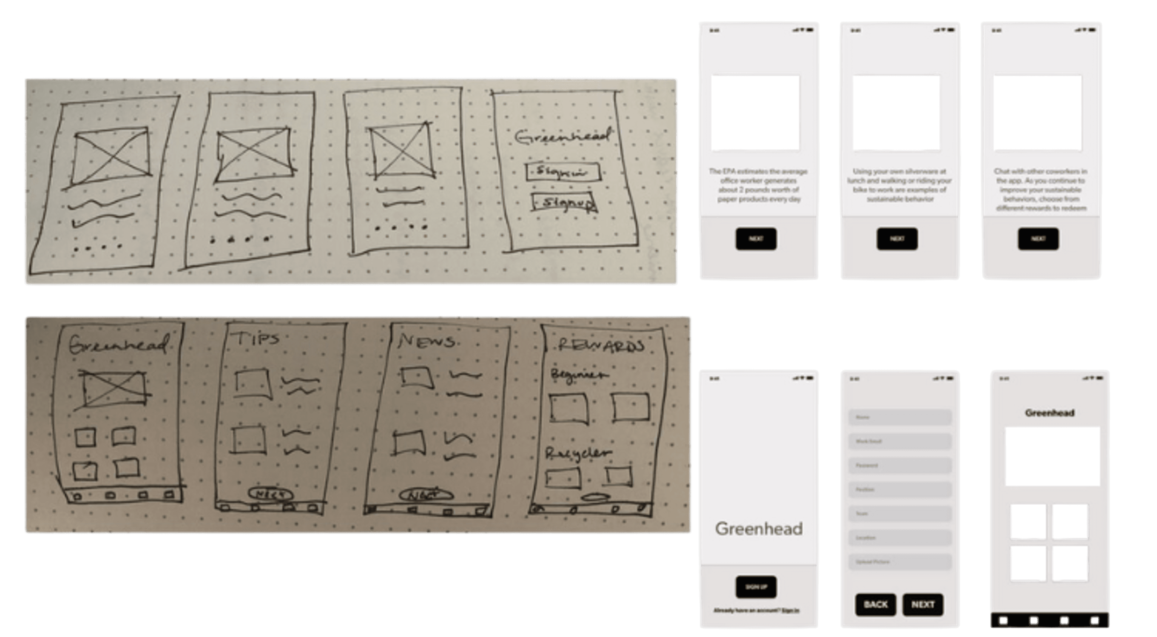
We created several key screens starting with sketches and then converted them to wireframes.
PROTOTYPE - 1ST AND 2ND ITERATIONS
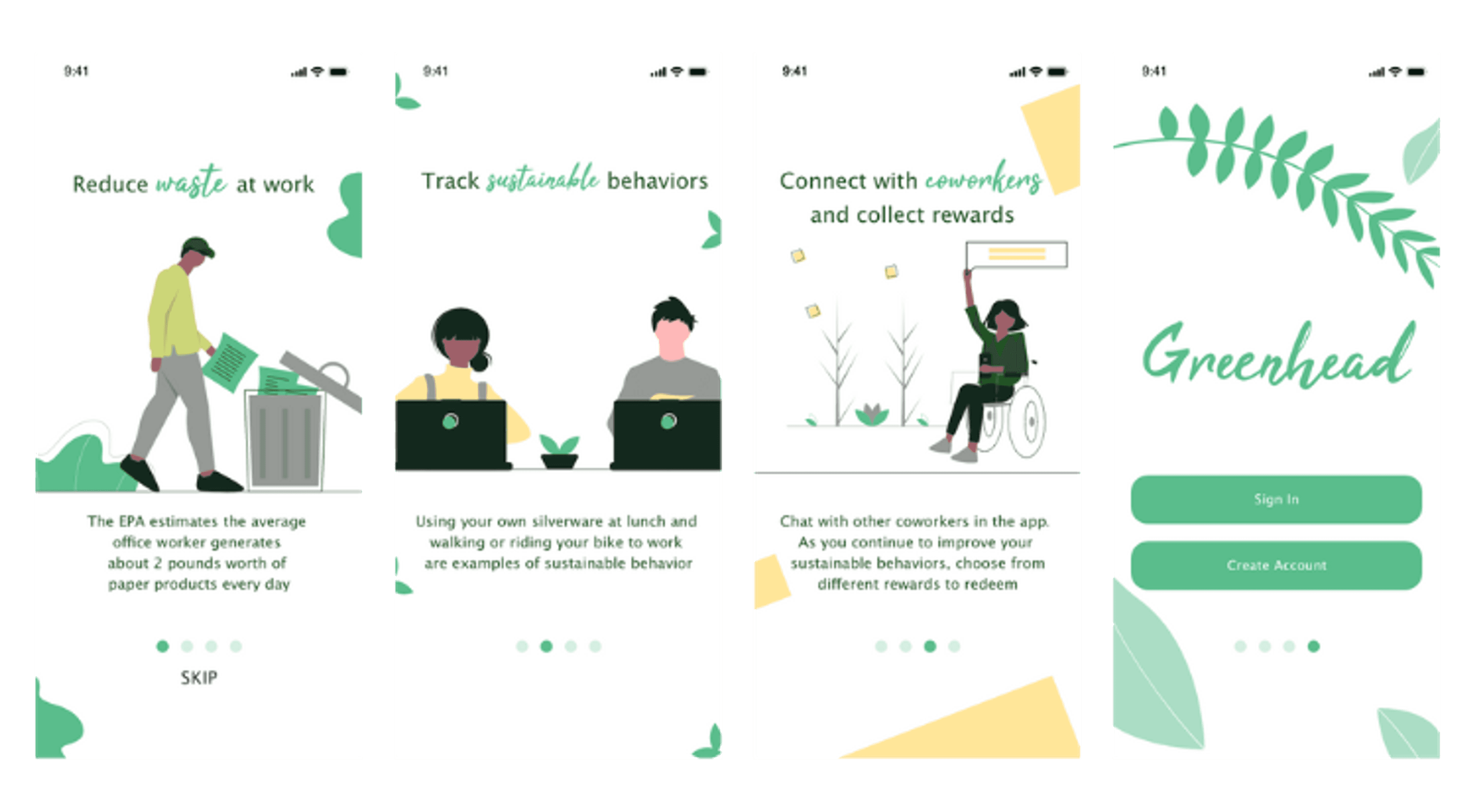
We created the first iteration of the Greenhead app and conducted a user testing session. We learned our font was too small and the exit options weren’t as obvious as they needed to be. Our second iteration key screens are showcased here.
